Lugiami
Branding, socials, presentations, logo (contract, via Noughtlabs) · 2021 · Kuala Lumpur, Malaysia
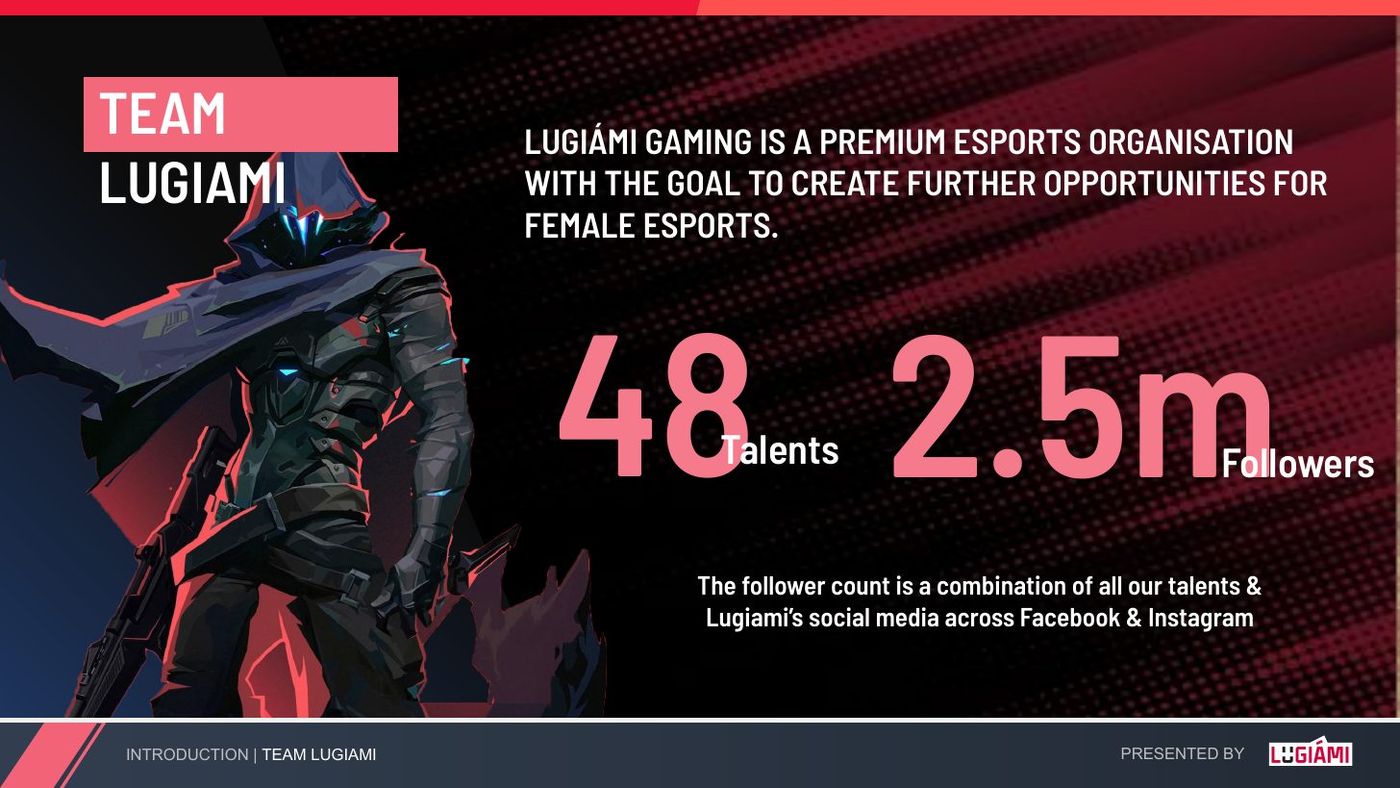
- 48 talents
- 2.5M combined reach
- Li-Ning jersey
Made a new esports org credible to sponsors on day one
A brand-new esports org for women had to win sponsors immediately, in a scene where most marks look like they want to fight you.
Built the identity from the wordmark up, with guidelines, pitch and talent decks and a Founder's Edition box. By mid-2021 it carried 48 talents and a Li-Ning co-branded jersey.
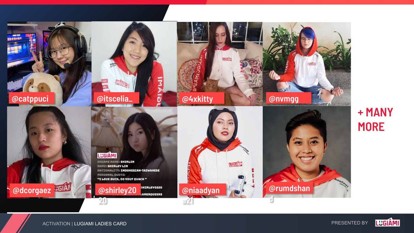
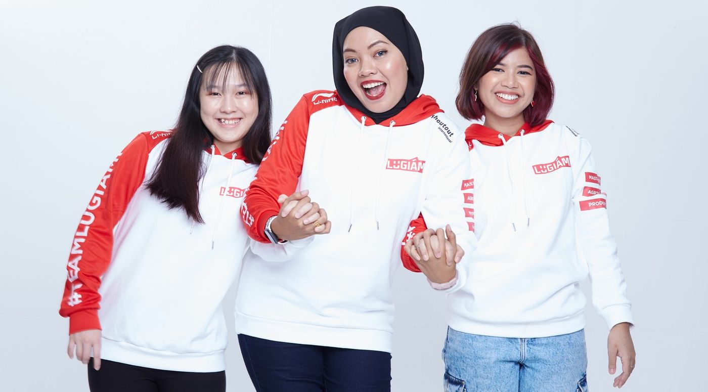
Lugiámi is an esports organisation for women, based in Kuala Lumpur. I built the identity from the wordmark up — logo, guidelines, socials, pitch and talent decks — plus the Founder’s Edition creative bundle with the jersey, sent out to female gamers across the community. The mark had to survive a sponsor pitch, a jersey, a stream overlay and a collab with NCT.
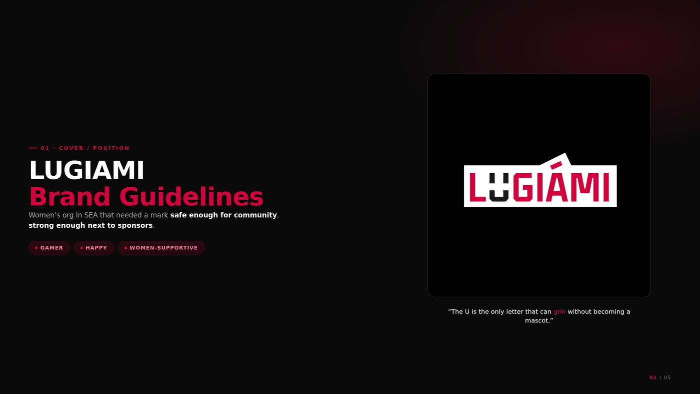
The U is the only letter that can grin without becoming a mascot.
- Wordmark
- Guidelines
- Founder’s Edition bundle
- Jersey
- Pitch + talent decks
- Social
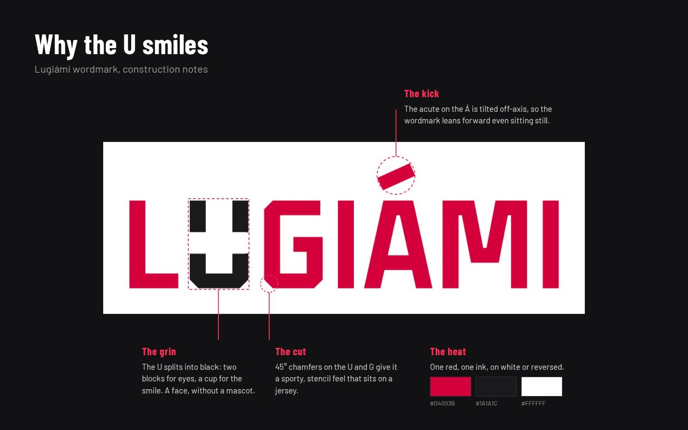
01Why the U smiles
Esports marks in the region default to aggression: shields, fangs, fire, chrome. Right for selling rage, wrong for an org whose whole point is a safe room for women who play.
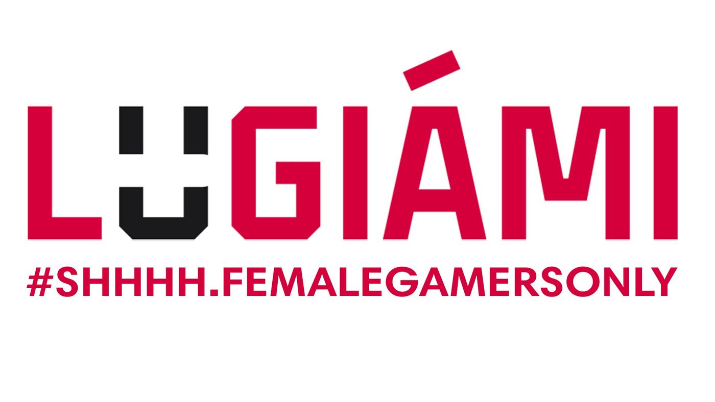
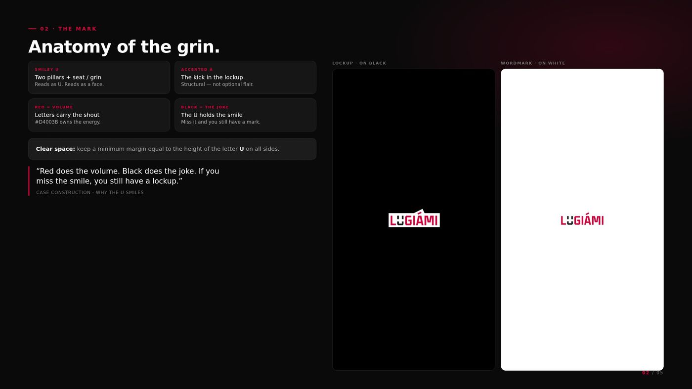
A wordmark with a face hidden in it. The U splits into black to make two eyes and a grin, 45° cuts give it a sporty, stitchable edge, and the acute on the Á tilts so the name leans forward. One red, one ink. Then a line to say it out loud: #SHHHH.FEMALEGAMERSONLY.
02Founder’s Edition — the bundle
Lugiámi’s first gamers and talents needed something to hold, not just a logo on a feed.
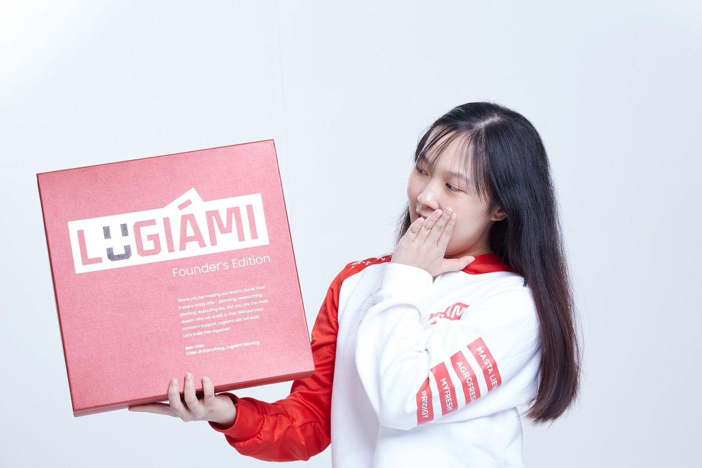
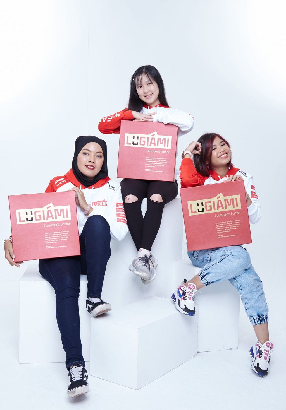
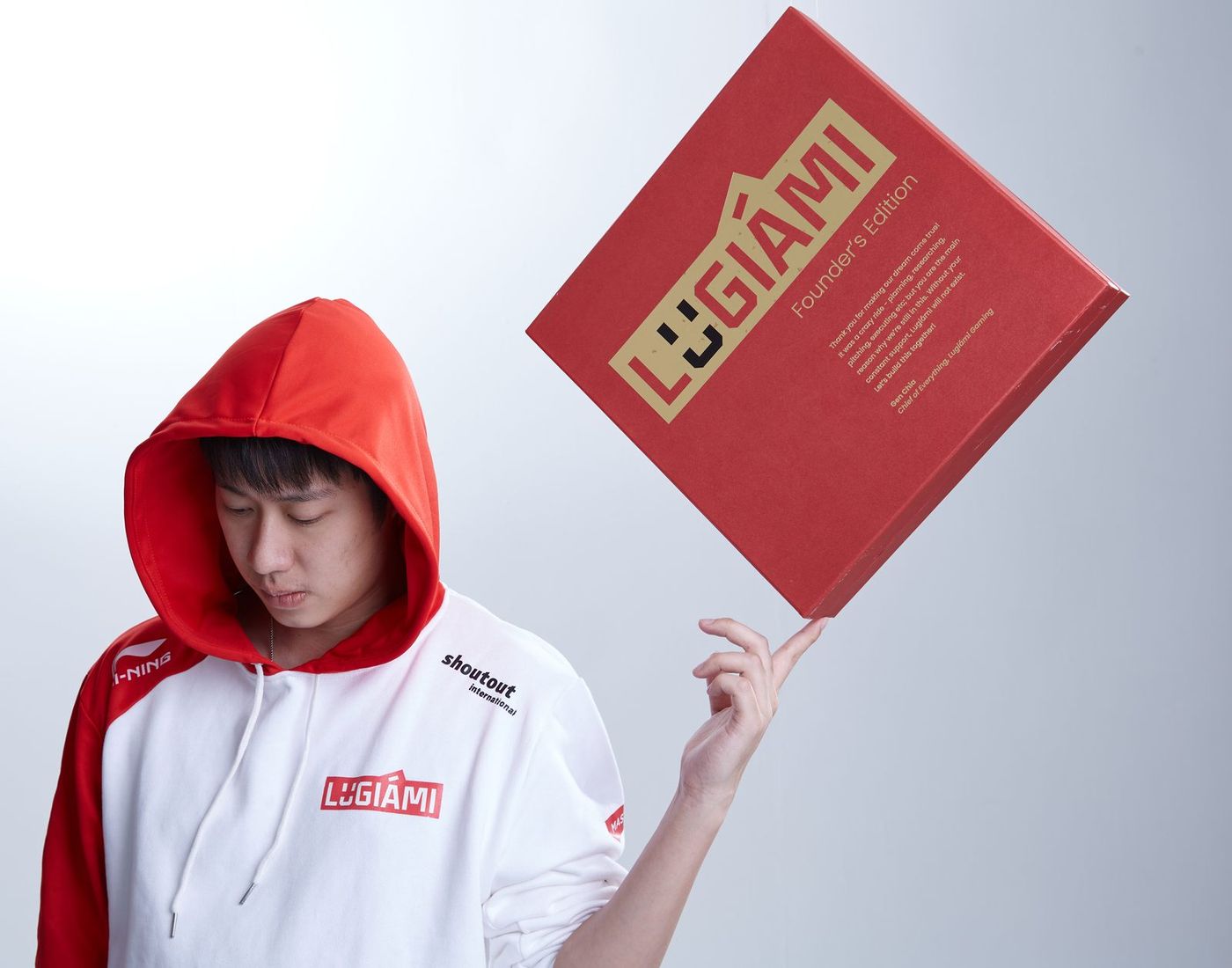
A red Founder’s Edition box with the wordmark foiled in gold and a thank-you note from the founder on the lid, carrying the jersey inside. Sent out to female gamers across the community — the brand, physically in their hands.
03The book
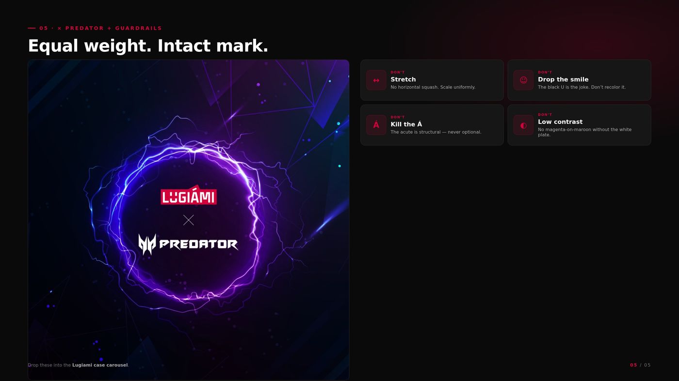
A smiling U is a nice idea until someone stretches it, kills the Á, or drops it on maroon without the plate.
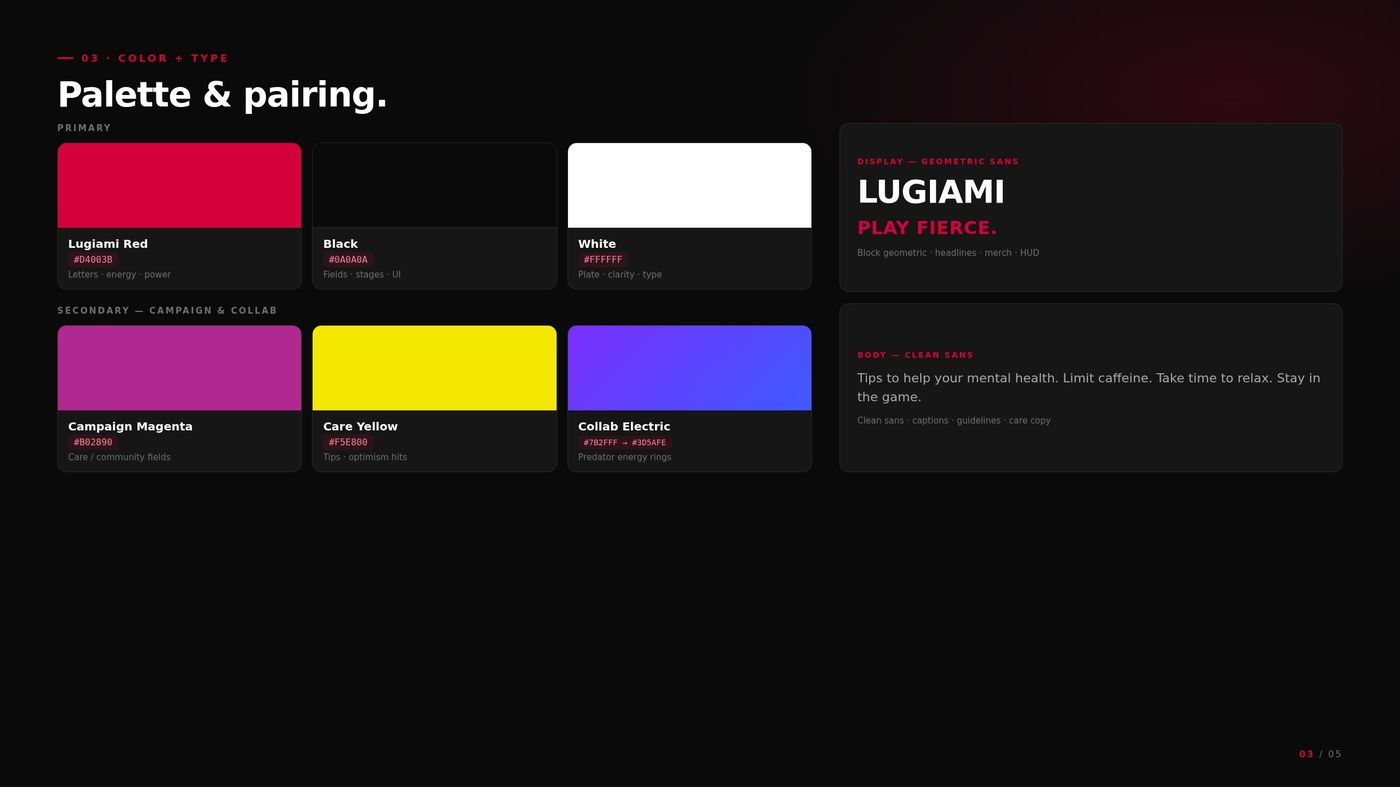
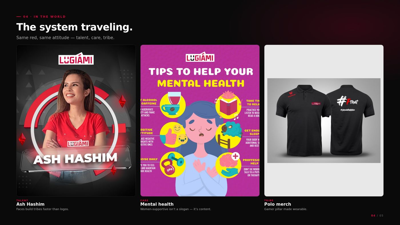
Five slides from the guidelines: cover and position, anatomy of the grin, palette and type, the system in the world, then the Predator lockup with the guardrails.
04The feed that had to live next to it
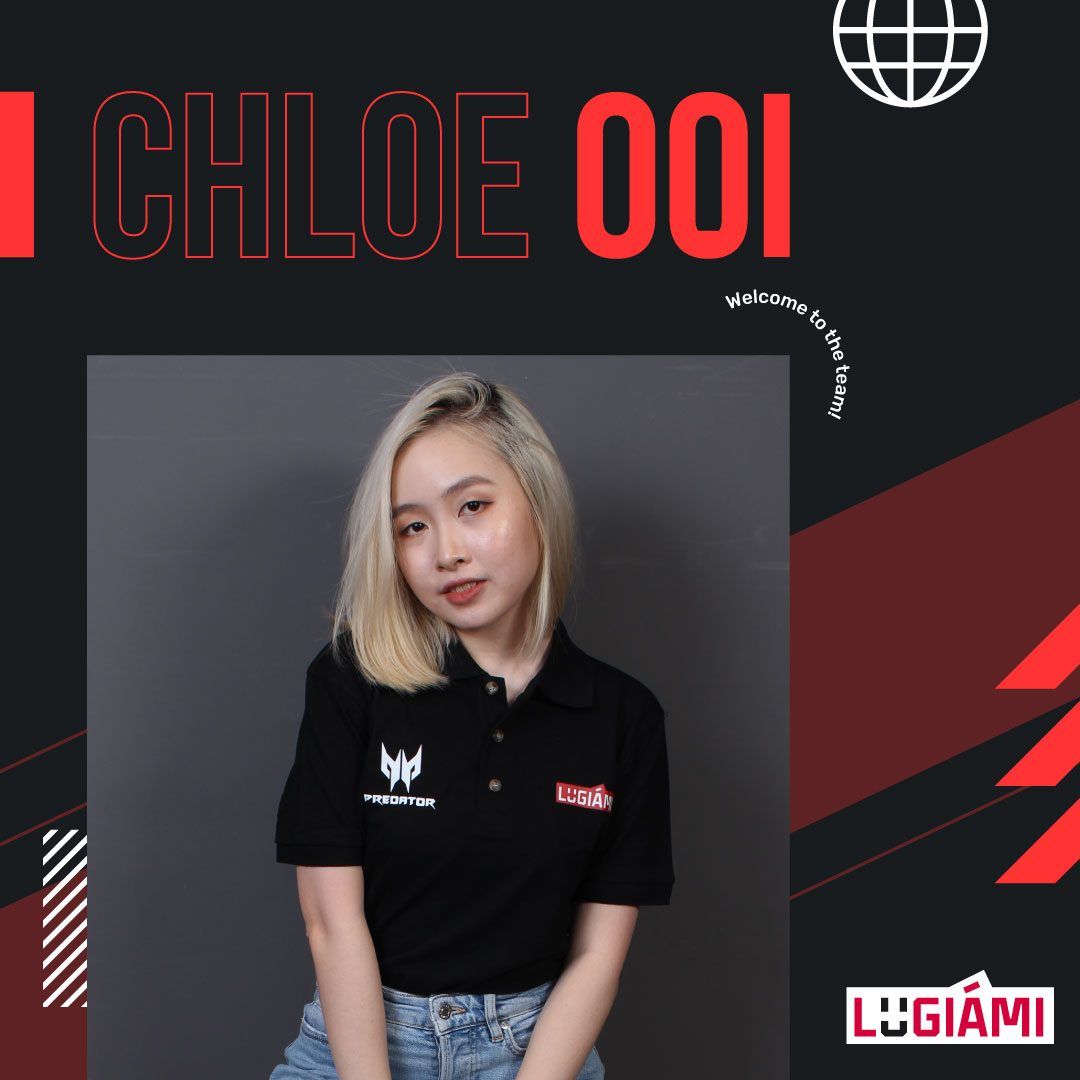
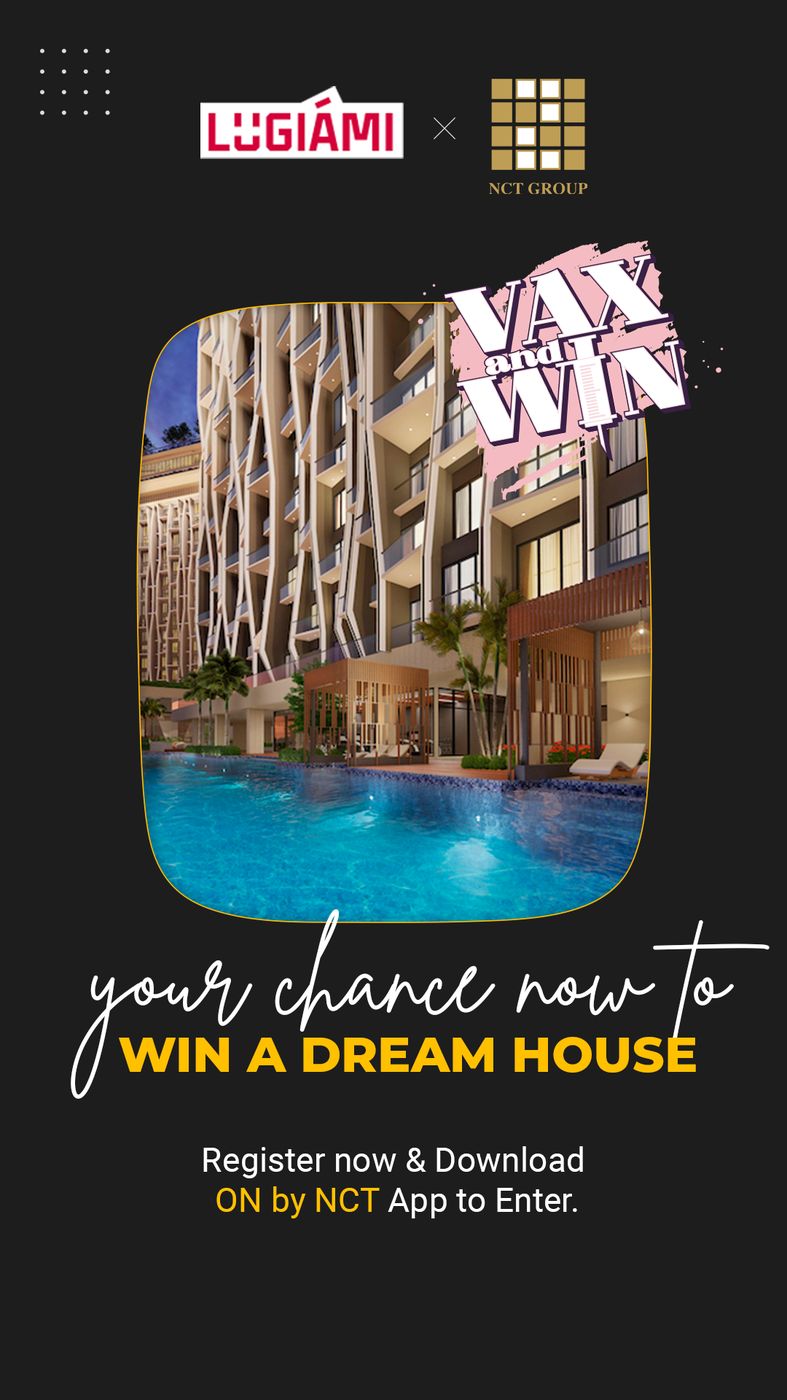
Drops, collabs, and community posts still have to sit on the same grid without looking like a catalogue screenshot.
Chloe and the NCT collab. Same red, same attitude. The smile on the U is the through-line.
05The deck sponsors actually sat through
A smiling U is not a commercial argument. Partners needed numbers, packages, and a face.
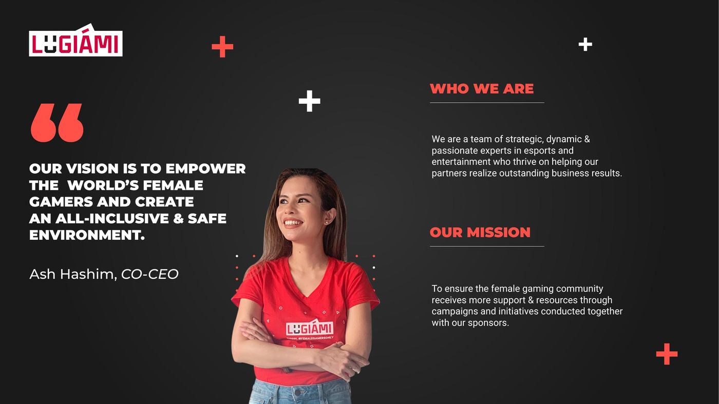
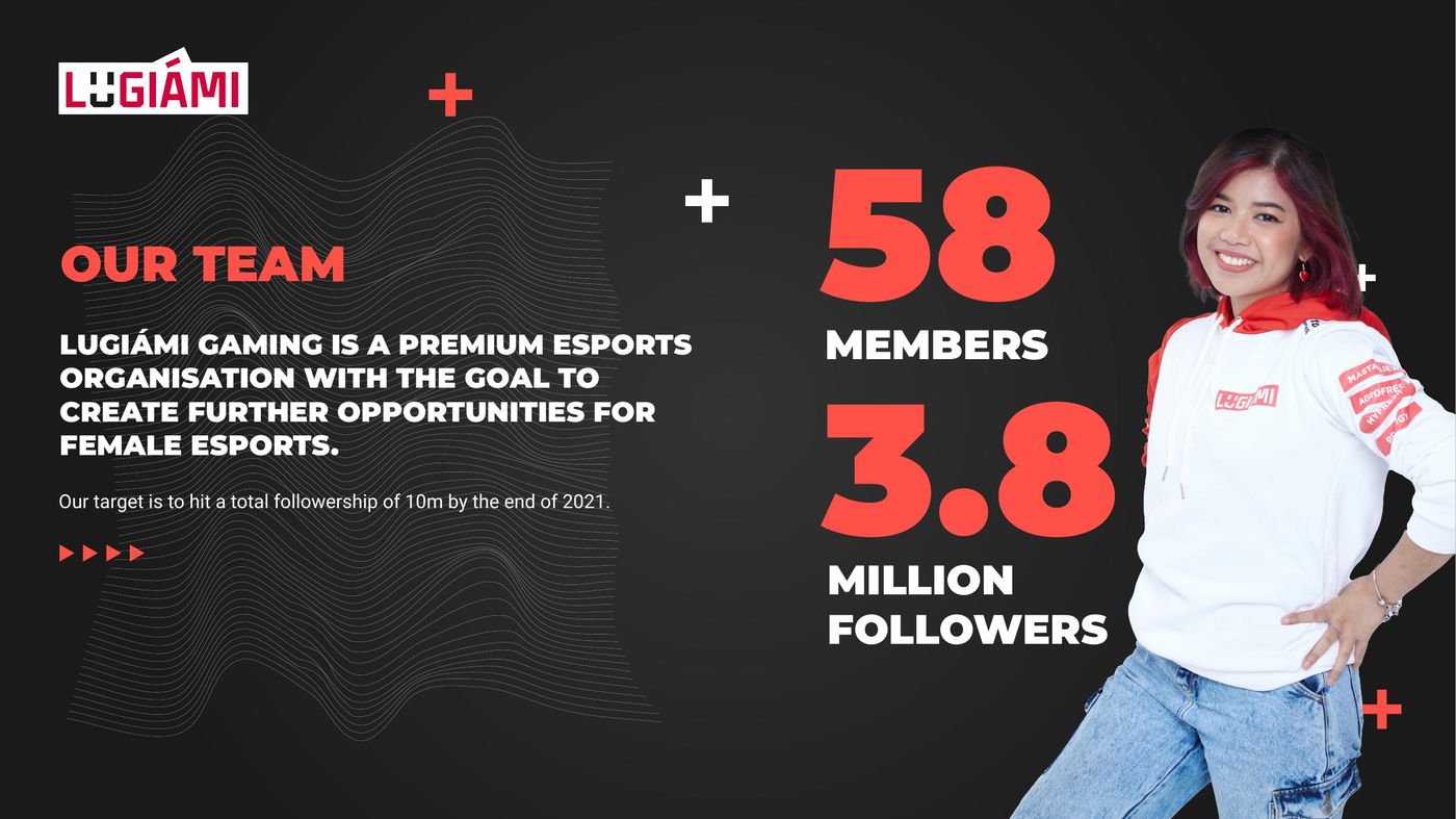
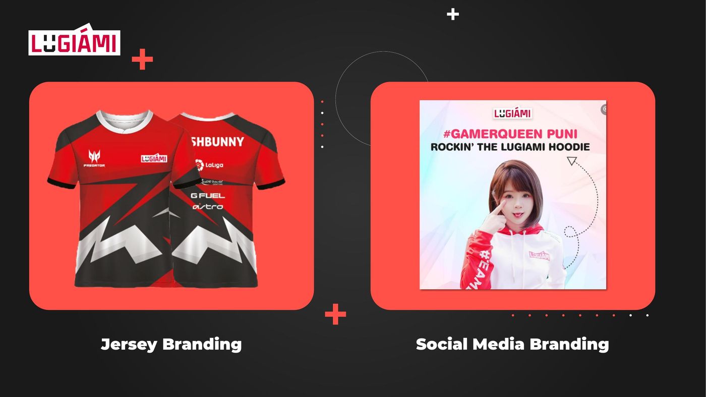
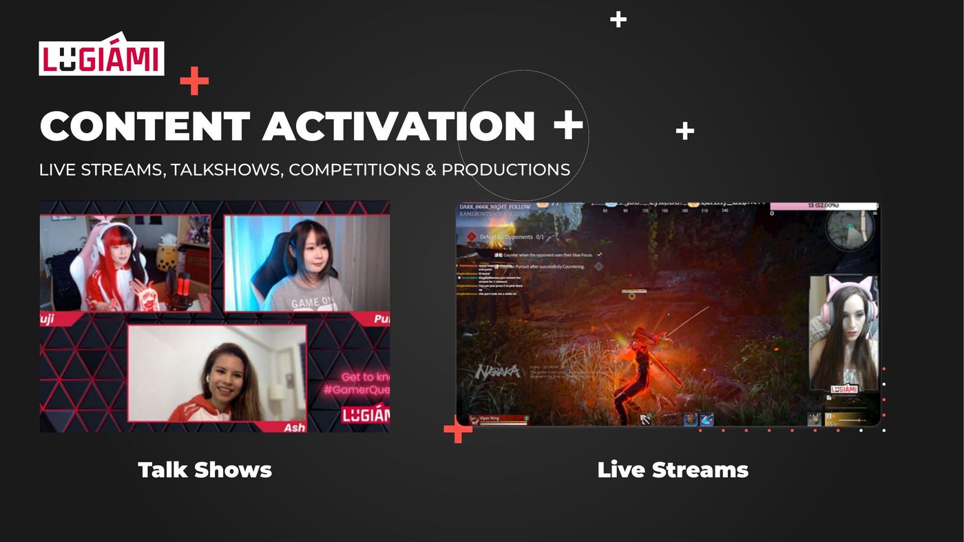
Pitch V4: cover, about, Ash’s vision on the branded tee, team stats, jersey + social branding, talk-show / stream activation, close.
06The talent deck
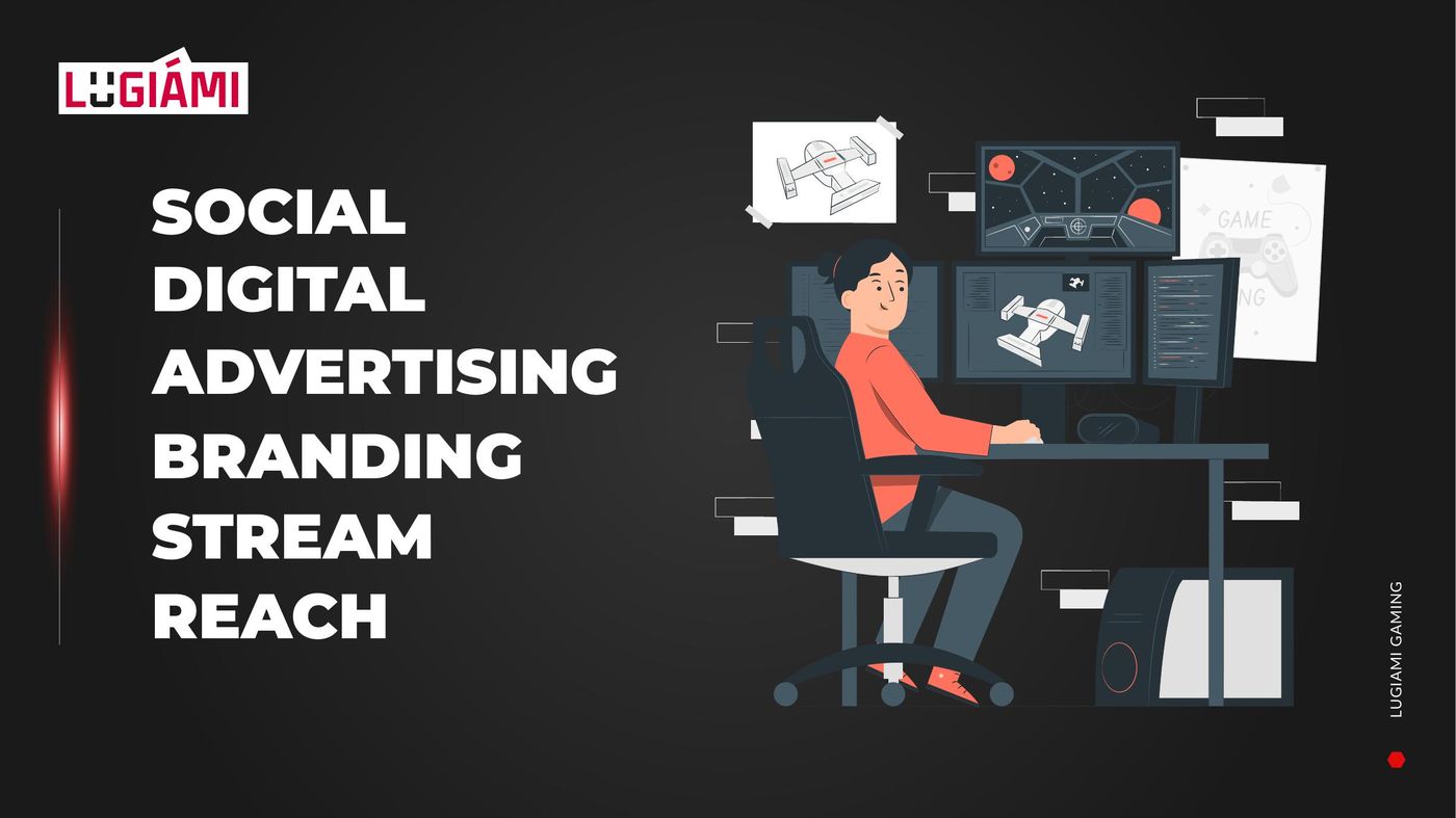
Sponsors don’t buy a logo, they buy reach. The org needed one document that put its people and its numbers in the same room.
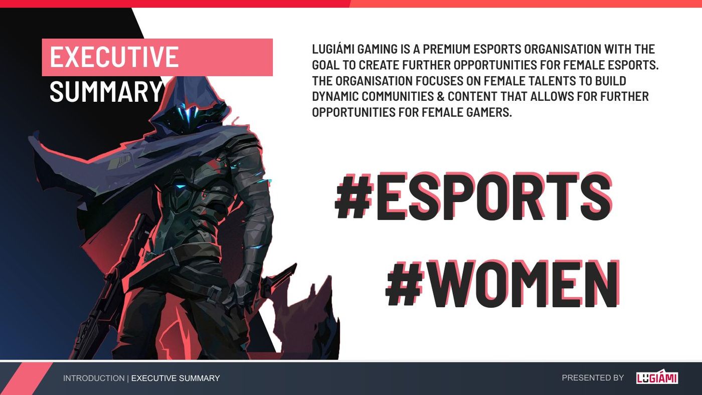
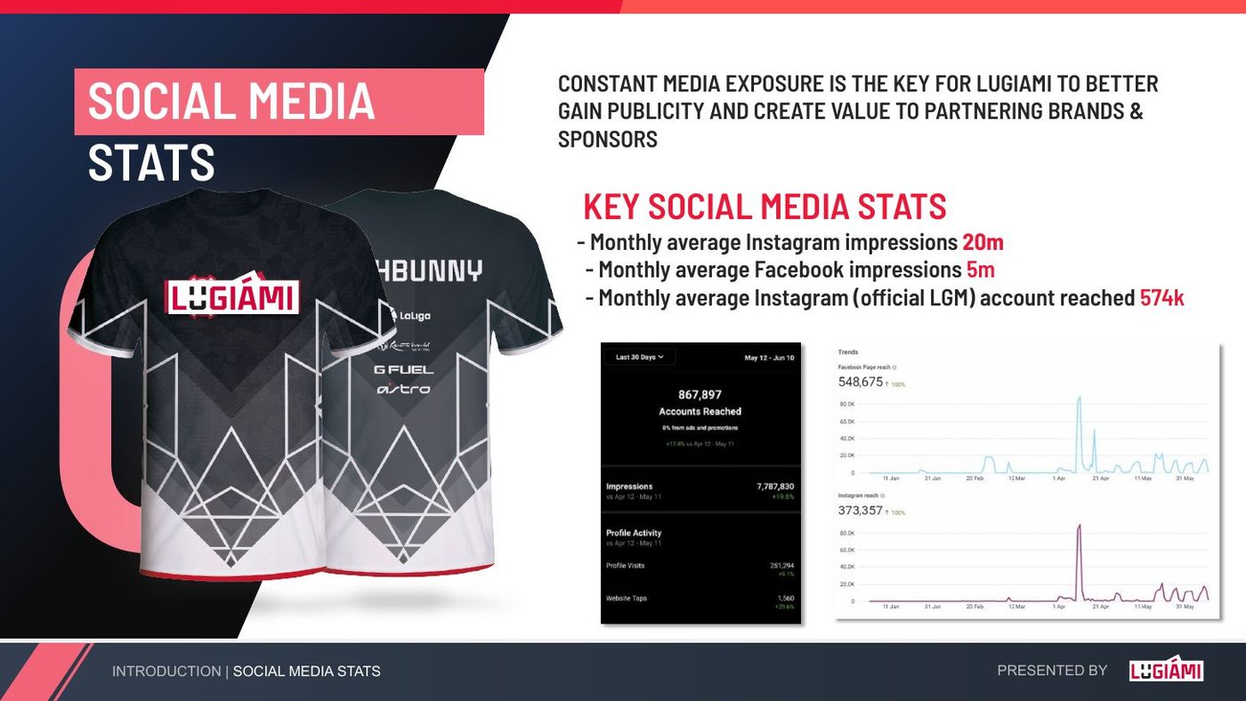
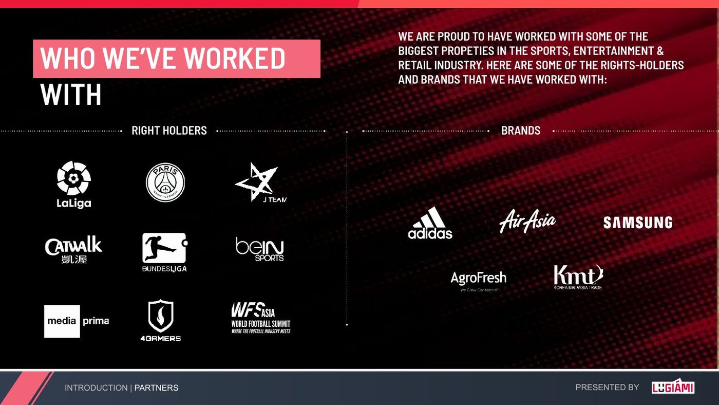
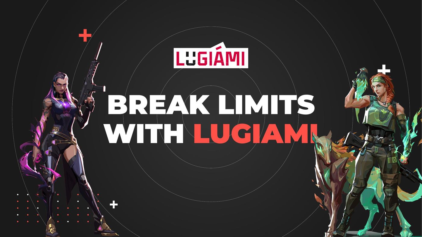
A talent deck in the same red: who Lugiámi is, 48 talents and 2.5M followers up front, social stats with the jersey, partners, then the roster — every face in the kit.