Capital Float
Internal brand + external marketing, via Graffiti Collaborative · Jun 2017 – Oct 2018 · Bengaluru, India
- 1 mark, whole system
- 8 HR templates
- Cards · IDs · values
Built an internal brand people actually used, from one mark
Internal brands usually die as a slide called Our Values. This one had to work on a mug, an ID card, an HR banner and the website.
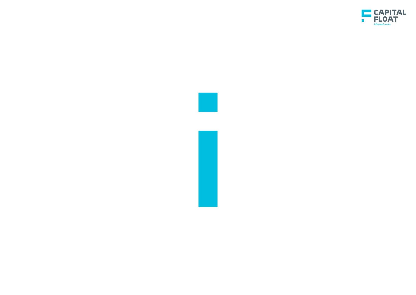
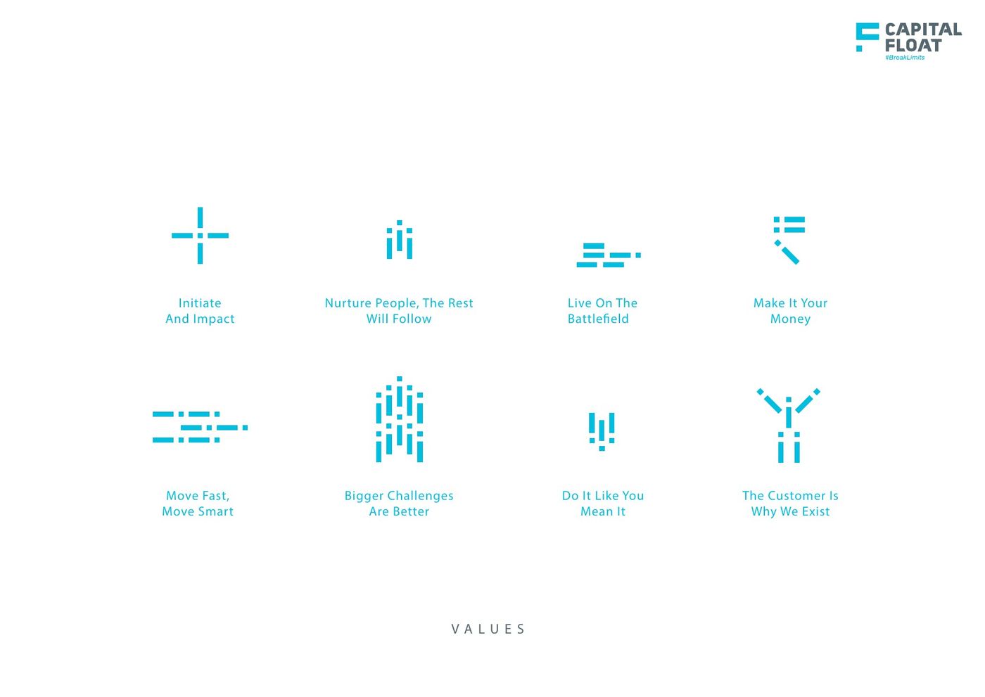
Designed the human 'i' and built the whole internal language from it: values, patterns, cards, IDs and an eight-template HR banner system.
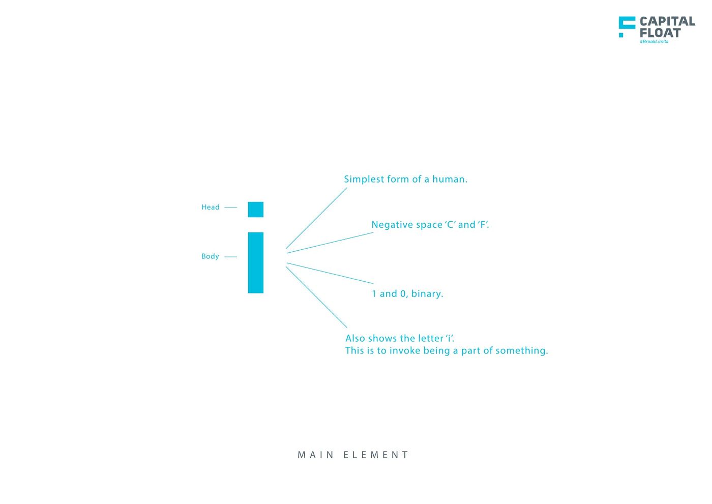
Complete internal branding — thought and design. The human icon that reads as the letter i, as a person, as binary, as negative-space C and F. Values drawn from that mark, patterns, cards, IDs, envelopes, the HR banner system. I also worked the public side: line-illustration social and the growth / warehouse site frames.
One person is an i. Many i’s become Capital Float.
- Idea
- Guidelines
- Values
- HR system
- Cards / IDs
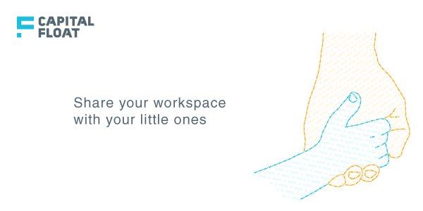
- External social
- Web
01The i
A finance company asking people to live the values needs a mark those values can be drawn with.
Simplest human. Head and body. Also the letter i — you are part of this. Three slides from the book.
02Objects people actually carry
A values poster is not a system. The system has to show up on a card, an ID, an envelope, a desktop.
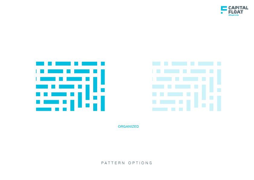
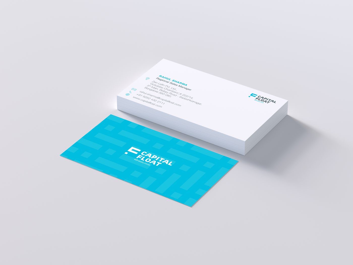
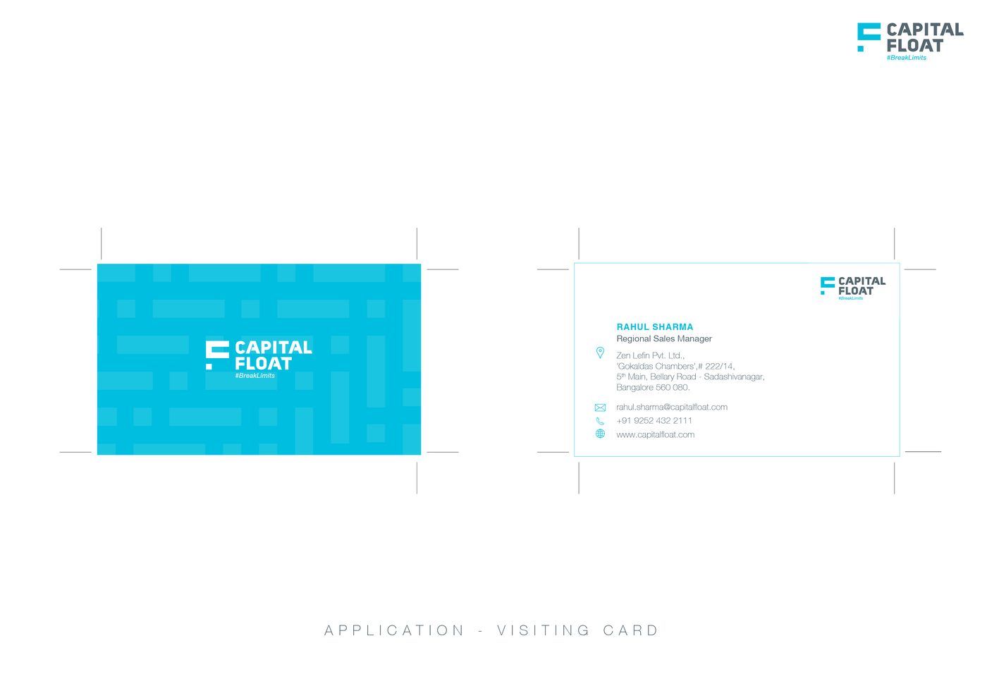
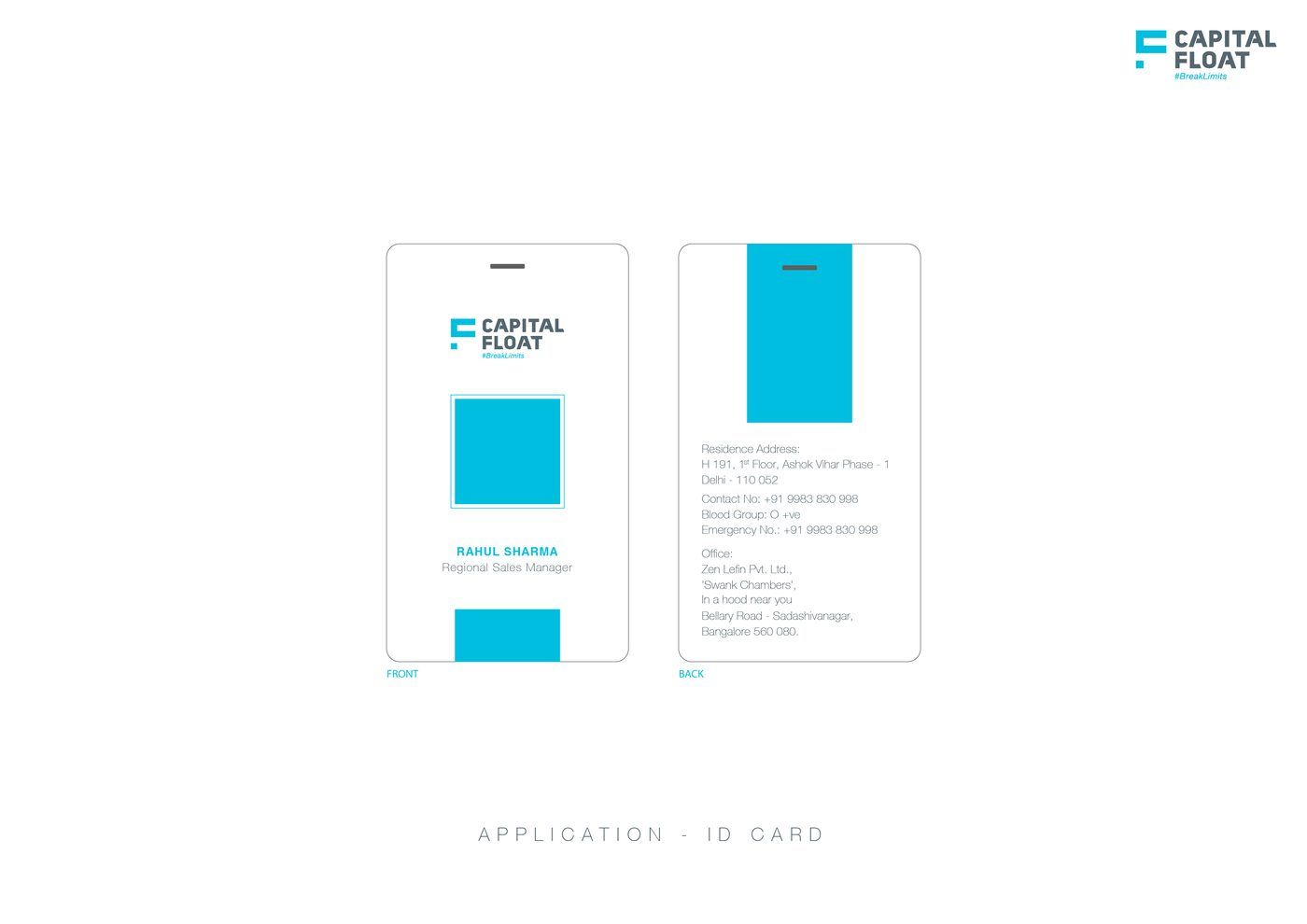
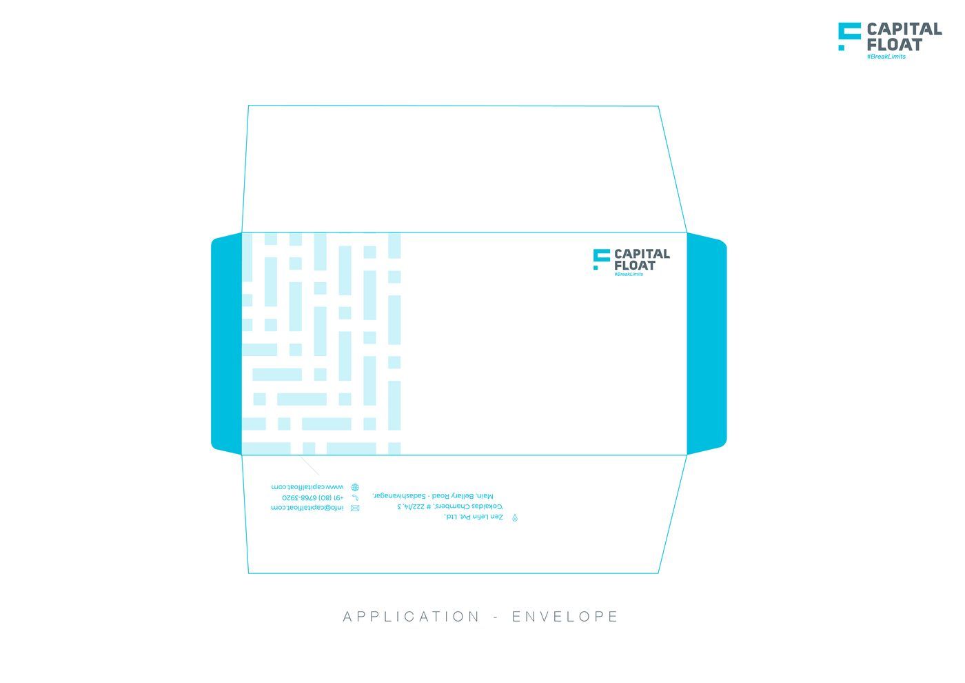
Pattern language, visiting cards, staff ID, envelope, wallpaper.

03The internal banner system
HR messages were being written in whatever template was open that week.
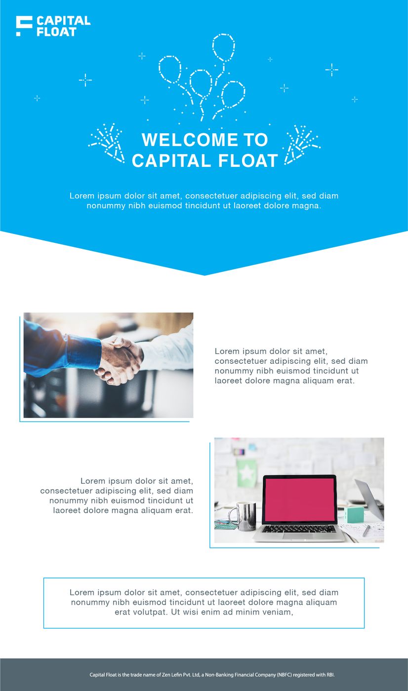
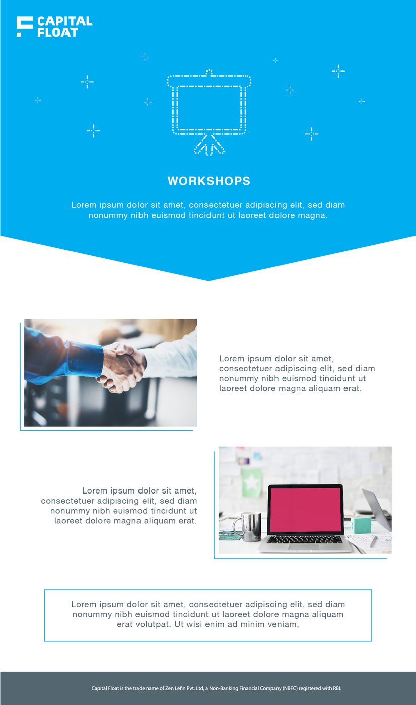
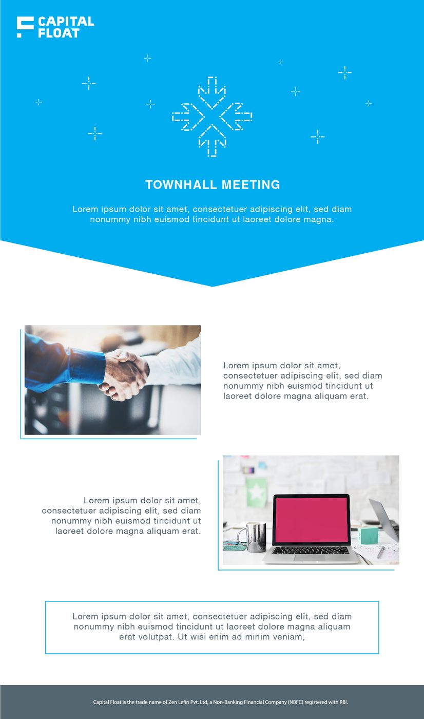
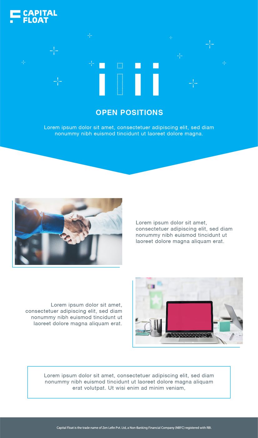
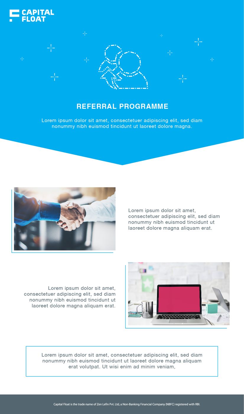
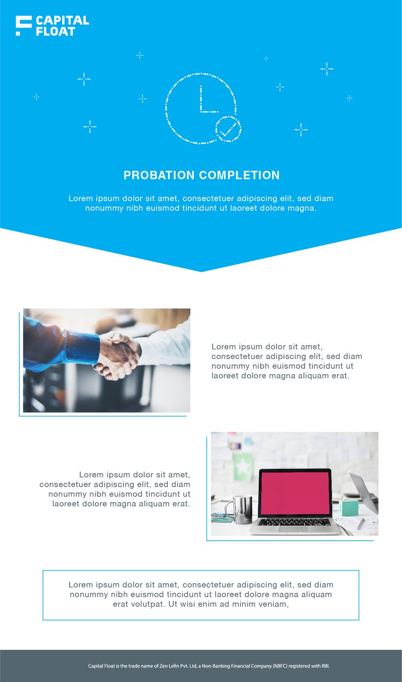
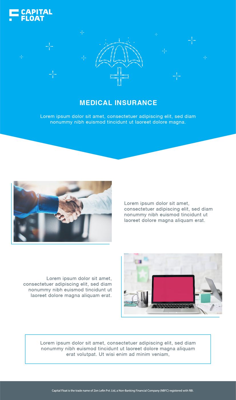
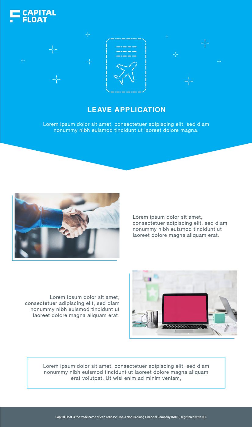
One formal frame. Icon changes, title changes, the rest of the page stays. Welcome, workshops, townhall, open roles, referral, probation, medical, leave.
04The public face
The same company still had to look like itself on the site and in the feed.
Line-illustration social and the growth / warehouse website frames.